- Home ›
- Tips for watercolour portraits ›
- Colourful watercolour portraits
Colourful watercolour portraits -
3 colour combinations for you to try
These three colourful watercolour portraits were all painted with a different limited palette of just three colours. If you are a beginner in watercolour you can try these! I have done all the pre-painting preparation for you so that you are left with the easy part: all you need to do is play and have some fun!
I decided to write this post and to paint the three versions of the same face because I want to show you the beauty of a limited colour painting. To show you that, contrary to what you might think, the success of a watercolour portrait isn't constrained by the limit of colours used.
And to demonstrate the effect that colour choice has on the visual impact of a painting and the mood that it sets. The story that it tells. The difference that using a combination of colours that are either predominately warm or cool will give you.
Not a "normal" skin tone in sight!
The combinations I have chosen aren't "normal" skin tone colours at all. Why?
Because.
The first thing that this does is to free you from having to concentrate hard on matching the colours that you see in your photograph. Not only will this allow you be be more adventurous and less anxious whilst painting, but it also frees you up to concentrate on two fundamentals in watercolour.
Matching tone AND understanding what will happen with the amounts of water in your brush and on your paper.
If you haven't painted a portrait in watercolour before, I would recommend that you try painting a monochrome portrait first. Monochrome portraits aren't boring, I promise!
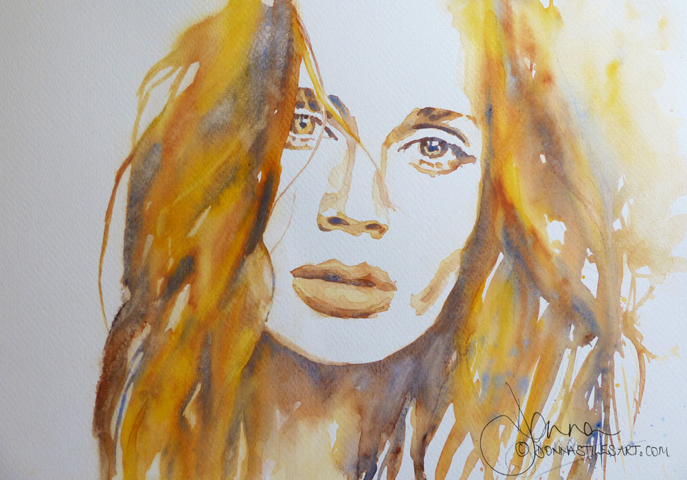
The first colourful watercolour portrait - the hot one!
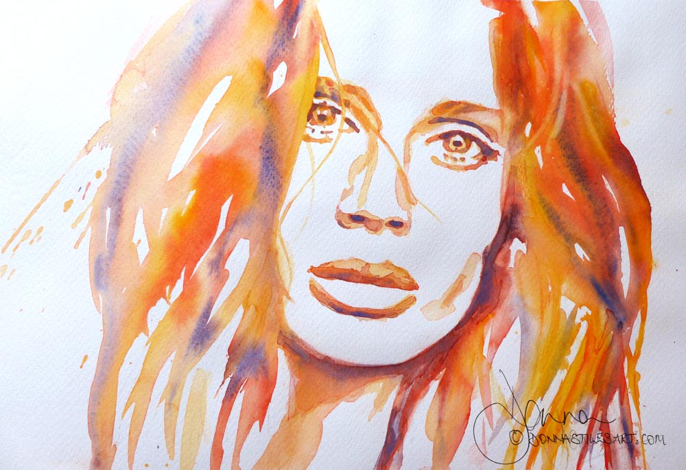
The colours I used are: all from the Royal Talens Van Gogh range:
Indian Yellow - which is a highly pigmented very warm transparent yellow. This is a stand up and shout out the joy of sunshine yellow! It's no wallflower and makes gorgeous oranges.
Permanent Red Light - again a very strong colour, warm, highly pigmented, and semi-transparent. It's a colour I don't use very often because for me it borders on opaque, but after many years of being the only pan in my palette practically untouched, I'm now loving it! The benefits of playing with your colours are you never know what you might end up loving!
Ultramarine Deep - a warm blue that granulates wonderfully. But here, although it is a warm blue, I am using it as my cool colour of the three. It has an important role to play.
TIP. Whether a colour is warm or cool isn't only dependent on it's pigment description, or it's place in your palette of warms and cools of each primary colour. It is also relative to the other colours around it.
Not only will it mixed with the Permanent Light Red to give me the darkest dark colour - my maximum tonal strength. It also neutralises the mix to give me some areas of repose from the bold yellow and red. Places for my eye to rest and then return to the hotter colours.
Where Ultramarine Deep it mixes directly into the yellow it will of course produce green - in this case a muddy, dull green. Another area of repose welcome in the painting.
However.
The order of adding the colours to the painting is key so as to avoid a dominantly green portrait. That said, green can be a very interesting colour to paint a portrait with!
BUT I need to tell you 4 things before you get started...
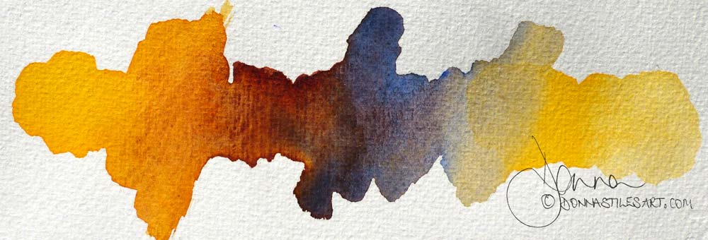
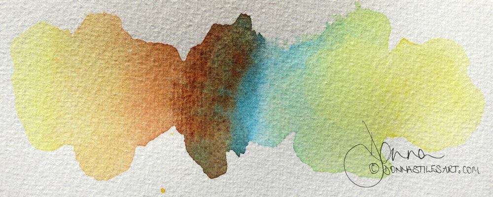
1. Always test out your colours before you start painting
Although I have chosen the colour combinations for these three portraits I want to stress the importance of testing out your colour choices BEFORE you start painting - both for mud and tonal range.
It is so very easy to make mud whilst painting with watercolour. But, if you try out your colours on scrap paper before you start, you'll give yourself the opportunity to see what they will produce when mixed together. Good and bad! To decide, perhaps, to swap a colour or two in the mix.
And. To see whether together they can provide you with the tonal range that you will need: at least a light, a medium and a dark tone.
All of which is nearly impossible to do or fix when you have started painting.
For the first of my colourful watercolour portraits I'm using a yellow, a blue and a red. I have painted the yellow at both ends of my strip of paper. Then I've added my blue on the right between them, mixing it with the yellow and I get a green. Then with a clean brush, I've added my red next to the blue and mixed it with the blue. And again with a clean brush mixed the red with the yellow on the left.
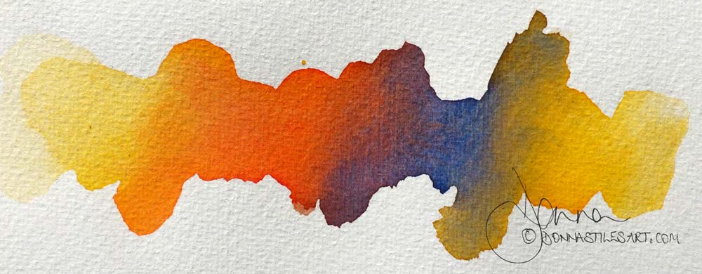
Now I can see what happens when each of my colours is mixed with the other.
And I can establish that the combination of my chosen blue and red pigments WILL give me a deep dark. That I have a variety of colours for my mid tones. And I know from the swatch, that with further dilution, that same yellow will give me even lighter tones.
2. The importance of the order in which you add your colours to your paper
We are going to use a red a yellow and a blue in each of these colourful watercolour portraits. But we aren't going to make mud.
From the colour testing we did above we can see that if we add our red to our yellow there is no mud.
That adding our blue into our red doesn't produce mud.
But that adding our blue into our yellow produces a neutral and a little muddy green. Which we won't mind having a touch of here and there, but isn't a colour we particularly want in our painting.
So, if we begin this hot colours colourful watercolour portrait with putting yellow down on our paper, then add in our red in places to that yellow - called "charging in" we will be fine. And if we only add our blue into our red, then we will be fine too.
In fact, in that order we will be working from the lightest tone, to medium and then to our dark tones. Which is perfect. Because it is by building our tones from light to dark that we can produce form: achieve a three dimensional image on a two dimensional piece of paper.
Now.
In order that all three colours don't have the opportunity to mix together into one mess we need to take action to prevent them from doing so. We need to not give them the water they need to travel around on the paper.
How do we do that?
3. Check how much water is in your brush each time you add a colour
We are going to reduce the amount if water in our brush each time we add a new colour.
The first big brush will be generously full of pigment and water, practically dripping wet. Our yellow.
Then, when we charge in the second - our red , we want a generous amount of pigment, but we don't want it to form a swimming pool when combined with the yellow. So we want a wet brush loaded with pigment, but not a soaking wet brush. We need enough water in the brush to enable the release of the pigment onto the paper when we touch it into the yellow. But not more.
This way the red will travel into the yellow but the total amount of water on the paper won't be enough for it to travel all the way into every part of the yellow forming homogeneous pools of orange.
If you think you have too much water on your paper you can:
- wait a moment or two for the paper to absorb some of the water.
- use the corner of a tissue carefully dipped into the pool to absorb some of the water.
- with to a brush that holds less water when adding in the second and third colours. Either a smaller size brush, or swap from a brush made with natural hair or a mix of natural and synthetic, to a pure synthetic brush. Which holds less water. Although, having said that, my favourite brushes are in fact pure synthetic brushes made to behave just like and with the full water holding capacity of natural hair brushes! But that's for another post.
Then, similarly, for our third colour. Less water in our brush still. We want a brush full of pigment, with enough water to allow the pigment to leave the brush when you touch the paper, but no more. In this instance the blue will travel into the red, but it won't travel as far as the red did when it was added into the yellow.
4. A helping hand to create beautiful transitions of colour
This one thing will create stunningly beautiful transitions of colour all on its own! And will stop watercolour cauliflowers/blooms from developing too.
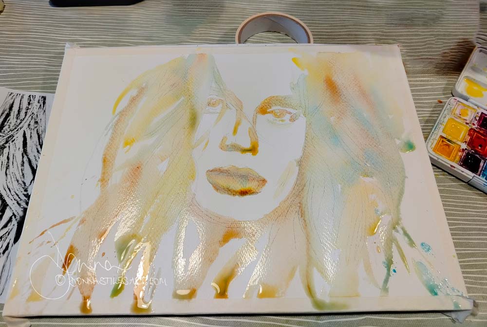
Before you start painting, place your block of watercolour paper or the board that you've taped your watercolour paper to on a gentle angle, with the upper most part of the paper raised. I tend to use the roll of kitchen paper I always keep to hand to rest my board on. Or, if it's a new fat roll and makes too acute an angle of the board, my roll of masking tape, or a book.
What this does is makes the water carrying the pigment that you place on your paper gradually run down the paper, creating mixes of it's own as it goes. As the water reaches the bottom of your paper, it will pool. At which point, but you will have plenty of time to do so, you can use a thirsty brush or the point of a folded tissue to mop up the excess, so that back runs do not form.
A tiny word of warning though!. If you use a LOT of water - I do! - then it will run down faster and pool quicker and may even drip onto your table or your lap, so don't wear your best clothes! Lesson learnt many a time!
OK, at last" Let's get started!
The second colourful watercolour portrait - still warm, but playing with neutrals
In this portrait I've kept two of the above three colours and only changed one. But the difference is striking.
This time, we still have Indian Yellow and Ultramarine deep.
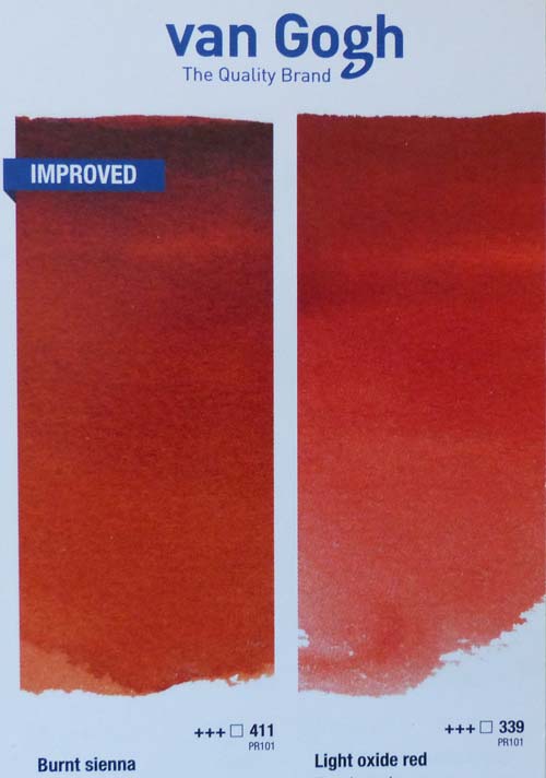
But for my warm red, this time I used Burnt Sienna. It might not say red on the tin, but it is a beautiful natural earthy red. Take a look at it in the Royal Talens watercolour brochure sat next to Light Oxide Red.
It's a natural pigment (rather than synthetic ) and as such, with the similarly natural pigment of Ultramarine blue, it forms wonderful granulating textures.
In fact the combination of Ultramarine blue and Burnt Sienna is the most famous of all. Together they form a beautiful warm grey, deepening to one of the darkest warm darks you could ever want. And they would give you a wonderful portrait just on their own.
But this time I added the Indian Yellow to the mix and loved it.
The order of painting
First. Yellow - apply the Indian Yellow with a big brush dripping with water and pigment. Dilute at first and then more concentrated where you feel it might be needed. Remember, as the water moves down the paper it will take some of the the pigment with it weakening your strength of colour.
And. Once dry, most pigments are between 15 to 20% lighter than when wet.
Second, Burnt Sienna.
Then, Ultramarine Blue into the Burnt Sienna.
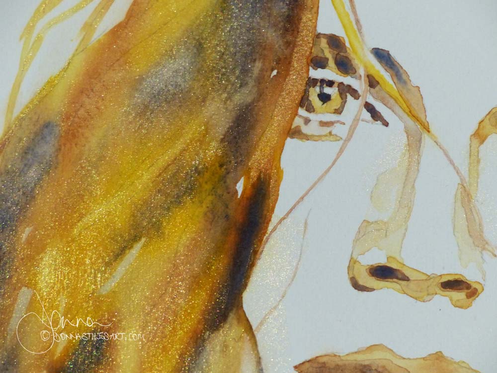
The now you see it now you don't surprise to this colourful watercolour portrait!
OK, I have cheated because this is, to be true, a fourth colour, but I used it as a glaze - metallic gold watercolour paint.
In my opinion the best gold watercolour paints around are also in the Van Gogh range and, just to spoil us, there are two - Light Gold and Deep Gold. I used Light Gold for this glaze in this portrait.
Which you can only see when the painting catches a certain light.
I'm now hankering after painting a lions head because I think this three colour combination would be just perfect. But that's for another day!
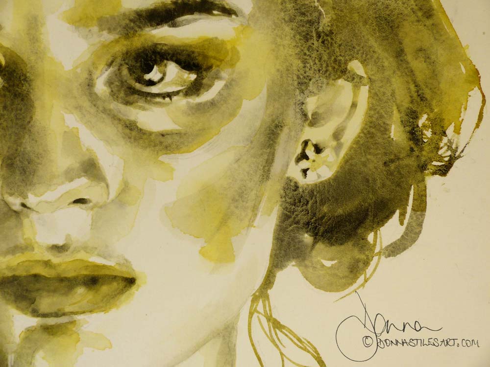
The third colourful watercolour portrait - the cool one
For the third colourful watercolour portrait I have kept Burnt Sienna as my warm red, but swapped both my yellow and blue for both a cool yellow and a cool blue.
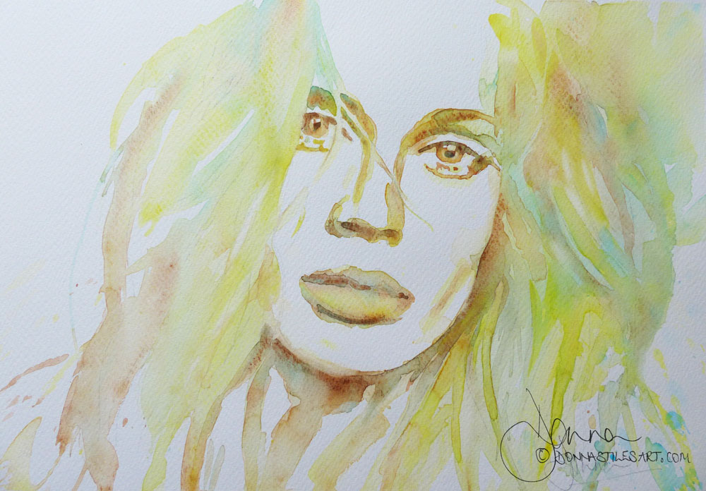
Permanent Lemon Yellow - a highly transparent vibrant yellow, verging towards green on the colour wheel. It's the yellow that produces the unbelievable greens of Tuscany spring days in full sunshine, and the light seen through white daffodil petals in England :)
And Cerulean Blue - this is low tonal value transparent blue verging towards yellow that, sat in it's pure form in your palette, belies it's huge strength! I use the Van Gogh Cerulean Blue and it is a very strong and staining pigment - a little goes a long way and once down on the paper it doesn't like to come up again! I virtually never paint with it without diluting it a lot first. Woe betide me when I touch my brush into wet pigment and then straight onto paper!
This portrait painting is much lighter than the other two, but we still have a good tonal range. In that we still have a light, mediums, and a dark. But each of these values is lighter than the light, medium and dark values used in the other portraits. The whole value range has been shifted to the lighter end of the spectrum. (You can read more about the importance of tone and why you don't have to paint as dark as your photo reference here.)
In this combination I wanted the green, so the colour order this time was in four steps:
A wet wash of Permanent Lemon Yellow.
Burnt Sienna into the yellow.
Then, Cerulean Blue into yellow.
AND for my darkest tone, Cerulean Blue into Burnt Sienna.
The watercolour painting materials for beginners that I used
The product links in this page are "affiliate links". If you click on them and make a purchase, I may earn a small commission at no cost to you. I only recommend products that I use myself and have no doubt that you will love too. More information can be found in my disclosure policy.
The watercolour paper I used is Fabriano 5 - a 50% cotton cold pressed (NOT) 140lb, 300gsm paper that is my go to paper for my watercolour students.
And the watercolour paints were all from the Van Gogh range by Royal Talens. Stupendous professional quality pigments at student prices that allow me to play to my hearts content with as much pigment as I want without worrying at the cost. It comes in large tubes not the tiny tiny ones that make you gasp when you squeeze some pigment out and half a tube has already gone!
Watercolour tips for beginners
A beginner in watercolour, just starting out? Try these watercolour tips for beginners first.
And, if it's portraits in watercolour that you want to paint, these tips for watercolour portraits too.
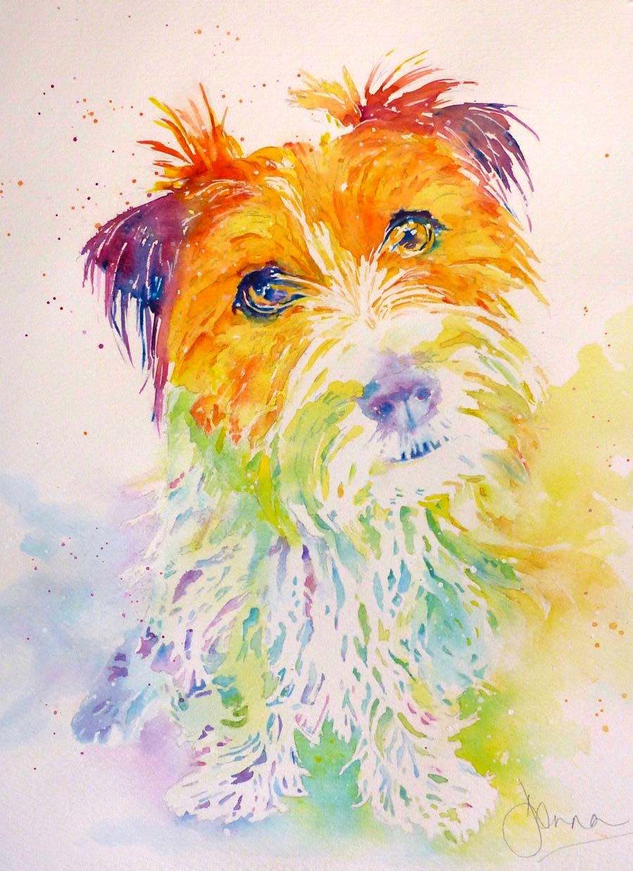
Colourful watercolour dog portraits
And, if you fancy painting your dog's portrait in a splash of colour, then take a look at these colourful watercolour dog portraits of mine.
This is lovely Silvia's little Nina :) whom I adored stroking whenever I went to my local art store and framing shop in Tuscany.
Starting out in watercolour and want to paint captivating portraits?
Sign-up for my latest tips, secrets, and terrific tutorials to get you through the disappointing phase faster and painting the portraits you want to.