- Home ›
- Tips for watercolour portraits
Top tips for watercolour portraits that will give you the results you want
These beginner tips for watercolour portraits will give you a head start in achieving the results you want to see, quickly.
Whenever one of my watercolour portraits doesn't turn out the way I intended or I find myself on an ever decreasing chance of achieving the likeness of my subject, it invariably is because I have gone astray with one or more of these.
Colour doesn't matter, tone does
Don't be a slave to two masters
You don't need to paint everything to achieve a likeness
Start in monochrome; that doesn't mean boring! Then with two colours, then three... I've given you three gorgeous colour combinations to try with all the hard work done!
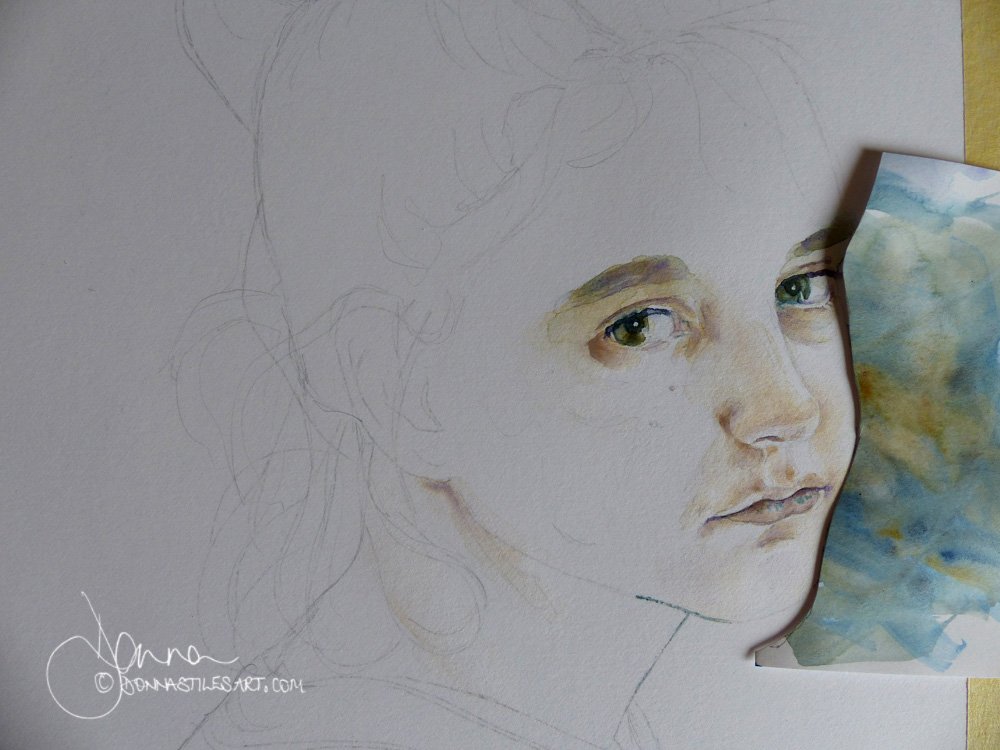
Get the drawing right
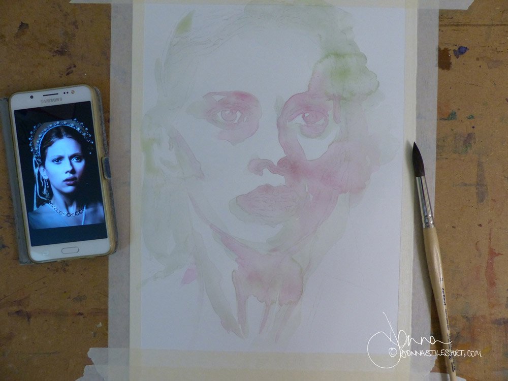
I want to spend the maximum amount of time that I can painting, so although I do draw out some of my subjects by hand, the majority of the time I transfer the image onto my watercolour paper. Using either sunlight through a window or, much quicker, more accurate and with less arm ache, with this simple method.
I am not going to tell you the number of times that I have struggled with getting a feature right in a drawing before starting to paint, lost patience because I want to paint, not spend all day drawing! And ended up telling myself - even though I know so well it won't work - that I can resolve it when I'm putting the colours down. It never works, those are the portraits that get binned or turned over for me to use the reverse for playing with colour.
And. If I don't take the time to go over my usually fine pencil lines in the key areas of the features, if not after the first wash, most definitely with the second, I can no longer see the lines and have to resort to drawing them on anew. Which never ends well.
So, do as I tell you and not as I do! Always take your time to get the drawing right and sufficiently strong.
But. Go easy on the pencil marks
But not heavy handed. You don't want the pencil lines to be showing through the final darks and being the dominant feature of the finished painting.
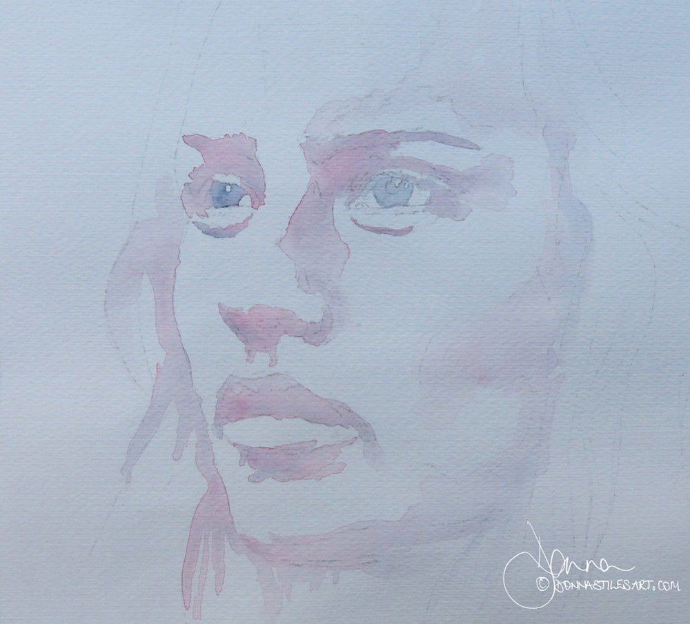
Colour doesn't matter, tone does
At the beginning of my watercolour journey I heard Stan Miller, a watercolour artist, say in a YouTube video I had come across that "colour doesn't matter, tone does".
That moment will forever stay in my memory for two reasons. I felt completely liberated: liberated to paint with all the gorgeous colours in front of me in any way I wanted! The joy was incredible.
And because what he explained worked. My portraits leapt and bound forward and I haven't looked back.
Tone and not colour defines a three dimensional form. You can paint in any colour you like but unless you get the tonal pattern right, you won't be able to create a three dimensional portrait on your two dimensional paper.
What I do before I start painting
I create a black and white photograph from my original colour one. On my mobile phone I use Snapseed, and on my computer Photoshop.
First I desaturate the image and then I increase the contrast. Sometimes, with a photograph that doesn't already have a strong tonal contrast - ie. with strong sunlight and clear shadows across the face - I need to turn that contrast dial up to an extreme to achieve a tonal pattern that I can follow.
Then.
When I pick up my brush, I think shapes and tonal patterns not face.
If you start to loose concentration on those patterns and shapes and start to tighten up, anxious about rendering the features correctly, turn your photo and the painting upside down! That works too :)
Tone is relative
So long as the relativity of tone is maintained, you don't need to paint as dark as your reference photo. In fact, in watercolour, this can kill the luminosity of this wonderful medium.
Don't be a slave to two masters
Once you have decided on the colours that you are going to use - they need to be able together to give you a tonal range that will take you from the lightest lights to the darkest darks - either put the original colour photograph to one side and out of sight, or the black and white photo that you made from it.
And if you have made a sketch drawing using Photoshop etc to trace the image onto your paper, put that away too!
Trying to paint with both or all three references in front of you will lead you up the sticky path of matching none of them. As I rarely paint a portrait in watercolour in the natural colours of my subject, I put the original photo away and follow the tones of my black and white photo.
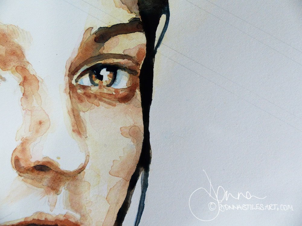
The eyes are the focal point
Make the principal focal point of your portrait the eyes by saving the meeting of your darkest darks with your lightest lights for that area.
Artist decisions
Photographs tend to put everything in equal focus. And render shadows and darks in equal strengths. Which means that if you are painting a portrait from a photograph, the darkest darks that you see in the image may be the pupils of the eyes, the nostrils, and even inside the ears!
When painting a portrait you want the primary focus to always be the eyes. For the viewer to be drawn to the eyes first before moving around the painting. And then back to the eyes.
Where the darkest darks meet the lightest lights in a painting is usually where our eyes are drawn to first. (An exception can be a single touch of red in a painting, which will always catch more attention. Red is red after all!)
Which means that you need to reserve your darkest dark pigment mix for the pupil and preserve the white of the paper for the light reflected in the eyes.
Which in turn means that you may need to make the conscious decision to not paint the inside of the nostrils etc as dark as they appear in your reference photo. But to make them a tone or so lighter than the eyes.
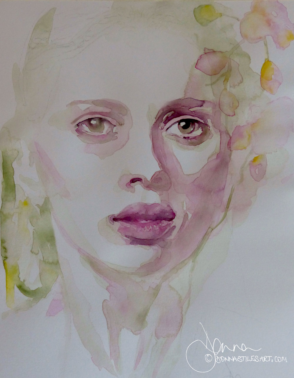
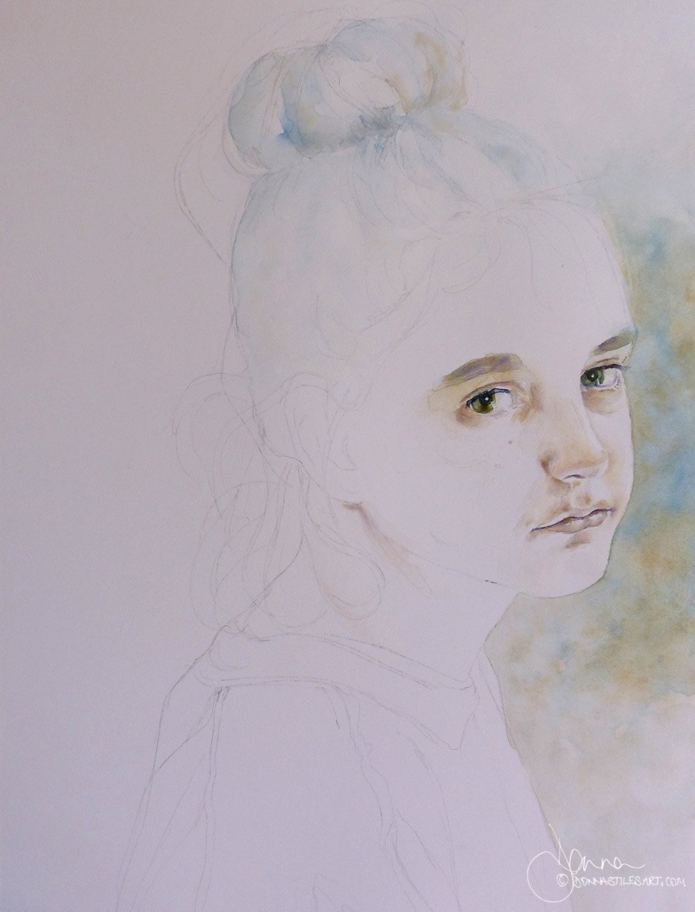
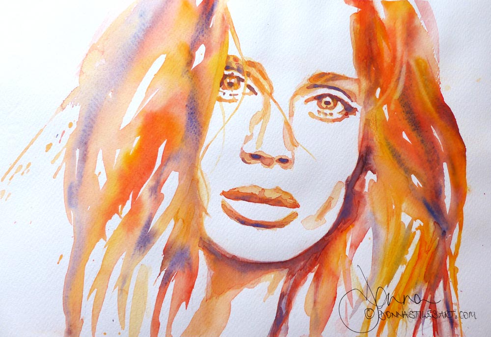
You don't need to paint everything to achieve a likeness...
You don't need to paint everything to achieve a likeness. In fact, very little is actually needed.
In the portrait below, only the first wash is down on the paper but already her presence is felt. It's at this point, when this first layer is dry, that the decision needs to be made as to how much really needs to be added to finish the painting.
Watercolour is a subtractive medium: each time you add a layer you cover the magical mix of pigments in the one beneath. And reduce the possibility of light being reflected back from the surface of the paper, loosing the medium's stunning luminosity.
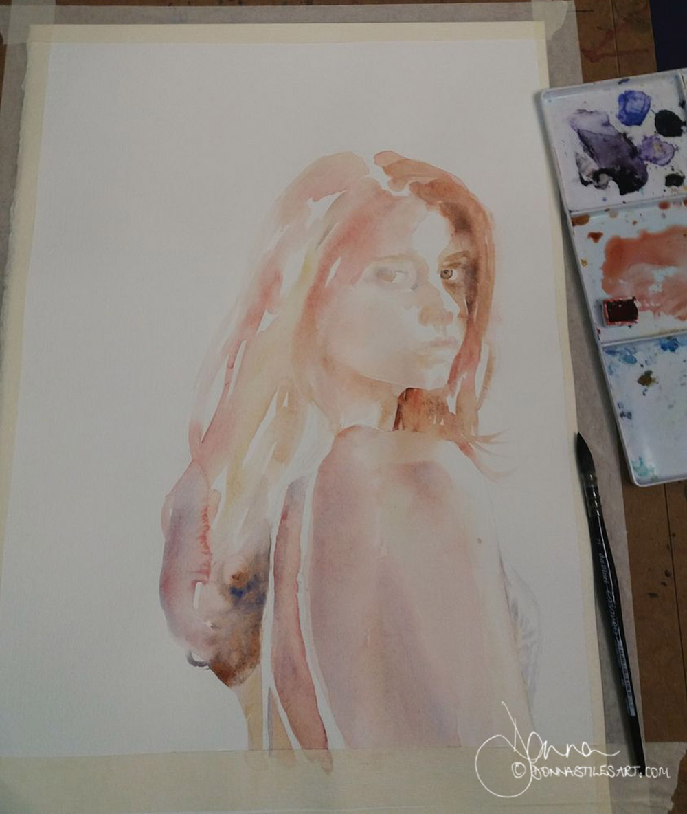
In this second example all that was going to be said by her had been, but I was in two minds still as to whether she needed a background. So I played with a couple of colour options - keeping to just the three colours that I had used in painting her: Armenian Golden Ochre, Prussian Blue and Ultramarine Violet.
(It is never a good idea in watercolour to introduce late in the day a new colour to the colours that you chose at the outset. It leads to disharmony that is near impossible to rectify.)
And decided that she did. And to paint some of her hair.
Start in monochrome - that doesn't mean boring black & white
If you are a beginner in watercolour my advice is always to start painting portraits in monochrome. Don't think of this advice as another thing you have to do or master that is going to slow you down from doing what you really want to. To paint portraits in colour. Because it will, in fact, speed up your watercolour journey so that you can do just that.
And by monochrome I don't mean black and white. Because a beautiful black in watercolour is one of the hardest things to mix - from two/three pigments - and can so easily lead to mud! And I don't want you to go down that rabbit hole! Not just yet!
Sepia is a perfect first pigment to start with.
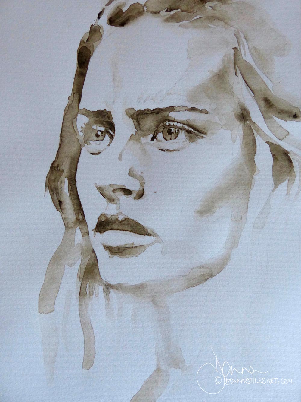
Painting watercolour portraits in monochrome frees you up entirely from thinking about which colours to you use and when and in what combinations. It eradicates the possibility of you making mud! And it gets you to look at the most important thing: tone.
Once you start to do that you will see areas of the portrait that are of a common tone. Areas that are linked by tone. And begin to see the portrait in terms of sections and shapes that will need only a first light tone, those that will need a second layer to darken the tone. And those that will need darkening even still.
Painting a portrait first in monochrome also enables you to work out and through the tonal patterns that you want to create in colour. To decide to adapt and change some for better effect.
So contrary to slowing you down, it actually takes you forward in leaps and bounds. Nearly every professional watercolour artist that I know paints their subject in monochrome first.
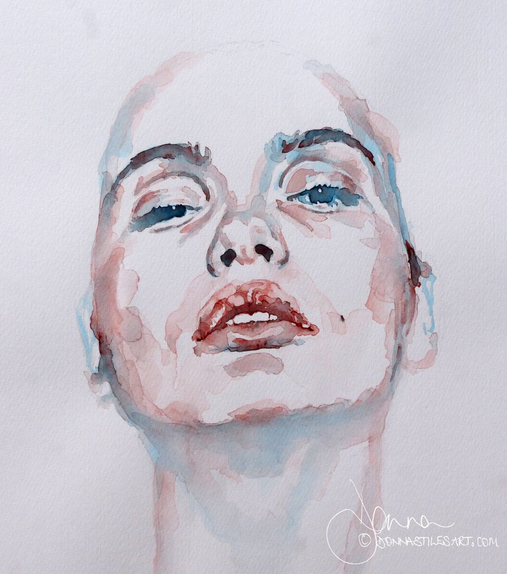
Then a two colour portrait
Once you feel confident with monochrome, choose a two colour combination that together will give you the range of tonal values that you need.
This watercolour portrait was painted in Royal Talens Van Gogh Cerulean blue and Schminke Madder Brown.
Then three...
Add a third colour to your palette and revel in the beauty of what just three colours can give you.
And learn how your colour choices can dramatically affect the immediate visual impact that a painting has.
Colourful watercolour portraits - 3 colour combinations for you to try
Then, go crazy with four, five, six... colours
When you have mastered painting with three colours, the world is your oyster and you can go crazy with four, five, six... colours.
BUT. And this is a big but. I want you to know that the most successful watercolour paintings, portraits or otherwise, are those painted with a limited palette. But that's the subject for another article!
Coming next...
More tips for watercolour portraits: how to paint hair in watercolour
Coming next in tips for watercolour portraits: how to paint hair in watercolour. You are going to need to use your shoulders!
Watercolour tips for beginners
These are my watercolour tips for beginners. The do's and don'ts of watercolour, whether you want to paint portraits, landscapes, or still life. Especially the
"Don't Fiddle",
"STOP!",
and "If in doubt, chicken out!".
Starting out in watercolour and want to paint captivating portraits?
Sign-up for my latest tips, secrets, and terrific tutorials to get you through the disappointing phase faster and painting the portraits you want to.