- Home ›
- Watercolour portrait paintings ›
- Watercolour skull
A watercolour skull - not your typical portrait!
The excuse? It was nearly Halloween...
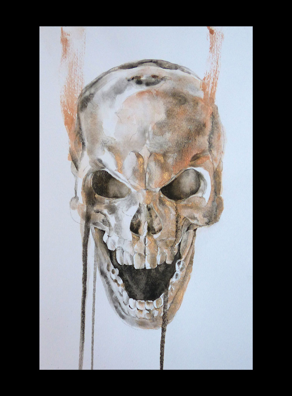
OK, so a watercolour skull isn't exactly what most people would call a portrait! But I had an excuse: Halloween was just a few days away and, as much as my daughter and I had enjoyed making Halloween decorations, transforming our house, and painting our faces in the years before, now it was apparently not her kind of thing. And so I took to my watercolour paints instead.
My first watercolour skull painting
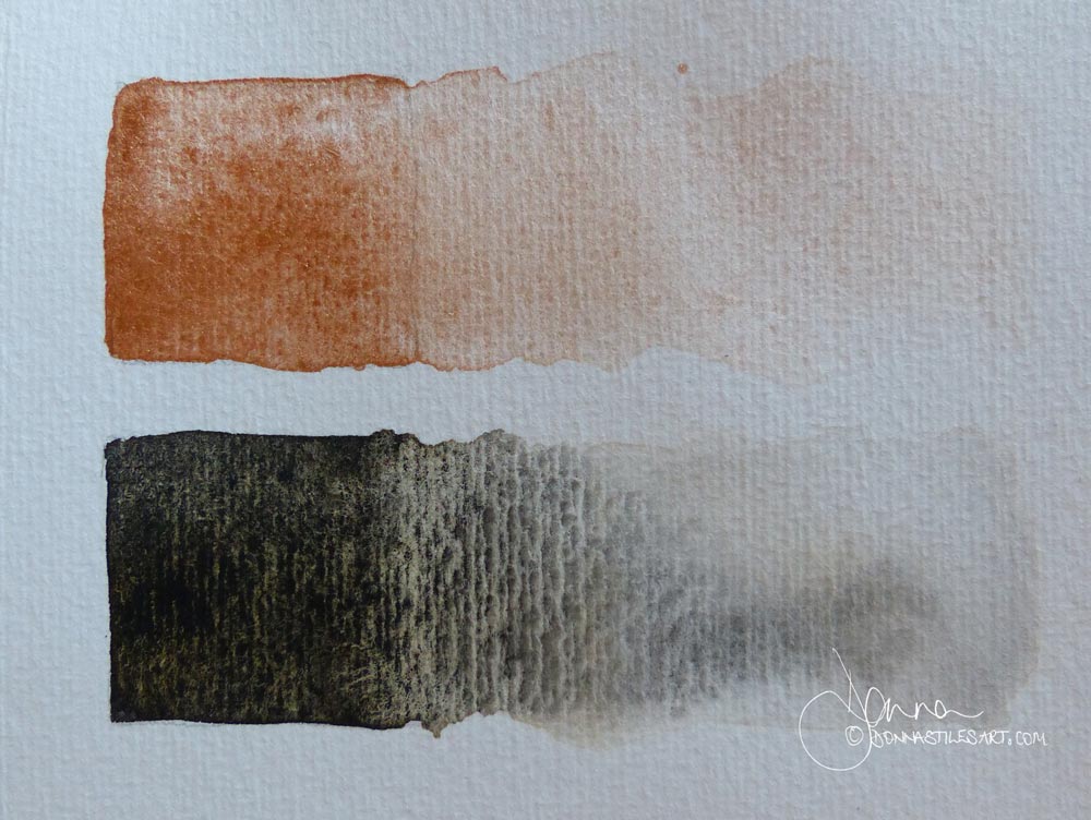
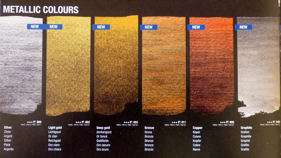
I painted him in just two colours: the fabulous granulating Van Gogh Oxide Black by Royal Talens and their Bronze. A rich metallic pigment that changes colour with the light. In full sun it shines just liked the polished metal.
This is what the two colours look like swatched out.
And how he came to life!
First layers and already loving the interaction on the paper that is happening between the Oxide black and the Bronze.
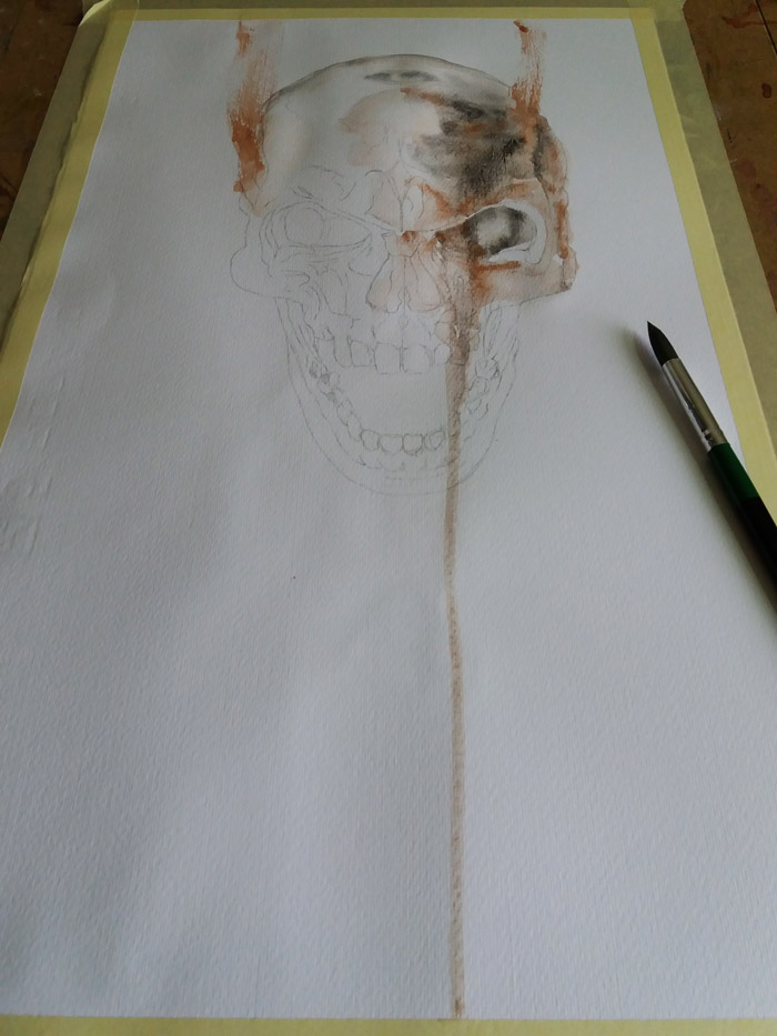
Concentrating on tonal differences to add three dimensional form and make his skull pop out of the paper.
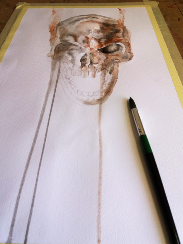
Now for the drama! Adding the black into the voids and he starts talking!
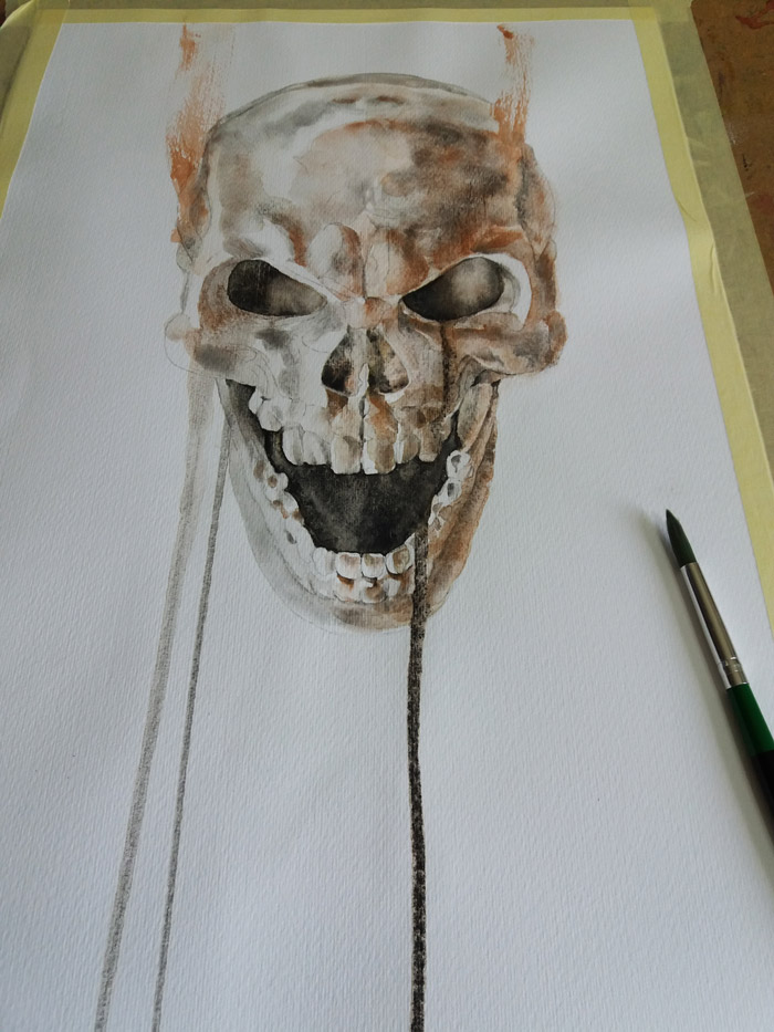
But he's not done yet: his cranium needs more shaping, as do his teeth (which are in remarkably good condition!). So he'll have to hold fire for a little while longer!
And there he is finished. My watercolour skull. This photo was taken in bright daylight and you can see what happens when the light catches the metallic Bronze.
The product link in this page is an "affiliate links". If you click onit and make a purchase, I may earn a small commission at no cost to you. I only recommend products that I use myself and have no doubt that you will love too. More information can be found in my disclosure policy.
From transparent shimmers to full on glow, the colour effects possible from the Van Gogh metallic watercolour pigments are just one of the reasons I consider them to be the best on the market.
A note about the Fabriano 5 watercolour paper
My got to watercolour paper is usually Fabriano 5, Cold Pressed (NOT) - a mould made 50% cotton paper that is a lovely brilliant white.
The medium texture of the surface of this cold pressed paper is great with granulating pigments: the fine undulations in the surface are just enough to allow the pigment particles to settle in the troughs and for some magical mixes to occur.
The disappointing thing, however, is that in this case because the Oxide Black is extremely granulating, once the pigment particles had settled, the machine-made vertical lines that are inherent in this paper and that don't normally bother me too much, became very visible.
I had to re-work the inside of his mouth - the greatest area of black pigment in the painting - to reduce their visibility.
I think I'll drop a line to Fabriano and see what they say. I'll post an update here if I get a reply.
Is it enough to make me change papers?
Is it enough to make me change papers? If I plan to use colours from the Van Gogh Dusk - the very granulating - range, then yes. I'm going to have to look for another brand.
My local art shop have just started stocking the Claire Fontaine watercolour papers which I have taken a peak at and there are definitely no lines. So I'll be trying those out soon.
Starting out in watercolour and want to paint captivating portraits?
Sign-up for my latest tips, secrets, and terrific tutorials to get you through the disappointing phase faster and painting the portraits you want to.